Welcome back, connoisseurs of the cinematic page-turn. I’m Dashiell Reeves, and if you’re here, you probably share my peculiar affliction: a love of books so deep that we willingly watch their video advertisements. Most book trailers are endurance tests, a parade of public-domain stock photos set to mournful piano. But this year’s crop was a strange beast—fewer outright disasters, but a maddening rise in slick, soulless competence. We’re grading on a curve, and the curve is a flatline of mediocrity. Let’s dig into the standouts, the pretenders, and the one that actually made me feel something.
The Gold Standard: When Pixels Meet Prose
The Star-Threaded Abyss by Elara Vance
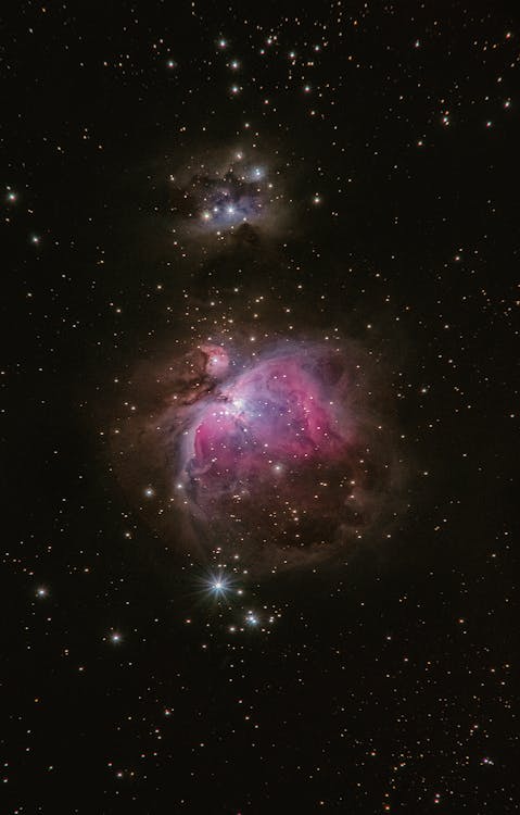
Finally, a trailer that understands the assignment. Vance’s space opera follows a cartographer who maps black holes using forgotten songs, and the trailer mirrors the book’s lyrical ambition. It opens not with a booming voiceover, but with a low, resonant hum—the supposed sound of a collapsing star—and a single line of text: “The universe is not silent. We simply forgot how to listen.” The visuals are a hypnotic blend of hand-painted celestial watercolors and stark, digital schematics of a ship that looks more like a gothic cathedral. No sword fights, no capes. Just a slow zoom into a nebula that resolves into a screaming face. It’s unnerving, gorgeous, and completely devoid of the usual fantasy clichés. This trailer doesn’t sell you a plot; it sells you a mood, trusting you to be intelligent enough to follow. A gamble that pays off beautifully.
The Competent Pretenders: All Polish, No Soul
This category is the most maddening. These trailers have budgets. They have professional actors, decent lighting, and original scores. And yet, they leave you feeling like you’ve been politely marketed to by a very well-dressed algorithm. They are the oat milk lattes of book promotion: inoffensive, vaguely trendy, and utterly forgettable.
The Last Governess by Miles Corrigan
Corrigan’s gothic thriller deserved a sharper edge. Instead, we get a montage of a woman in a high-collared dress drifting through a misty estate, intercut with a candle, a raven, and a letter sealed with wax. It’s a checklist of gothic imagery with zero genuine dread. The breathy voiceover whispers, “In this house, the children aren’t the only ones with secrets.” Groundbreaking. The book itself is a smart, feminist subversion of the genre, but you’d never guess it from this by-the-numbers effort. It feels engineered to be skipped after five seconds on a pre-roll ad. For a masterclass on building actual tension, contrast this with the principles in our earlier piece on Why Most Book Trailers Are Terrible and How to Fix Them—the difference is night and day.
Quantum Thief by Anya Sharma
Here we have the opposite problem: all style, no substance. The trailer is a kinetic assault of neon grids, glitching holograms, and a synthwave track ripped straight from a 1980s direct-to-video sci-fi flick. It’s visually arresting for about ten seconds, then it becomes exhausting. The plot—a con artist who steals memories from parallel-universe versions of herself—is buried under a mountain of aesthetic. The trailer screams that the book is cool. It forgets to mention it’s clever. A missed opportunity: a sizzle reel for a movie that doesn’t exist, rather than an invitation to a rich, mind-bending narrative.

The Wild Cards: Flawed but Fascinating
These trailers didn’t quite stick the landing, but their sheer ambition makes them more memorable than the polished mediocrities. I find myself thinking about them days later, even while wincing at a particular creative choice.
The Cartographer’s Daughter by Leo Finch
This trailer is a single, unbroken four-minute shot. A camera pans slowly across a vast, hand-drawn map on a wooden table. As it moves, miniature figures and landscapes come to life through subtle, practical animation: a tiny paper ship bobs on an ink sea, a wisp of cotton smoke rises from a painted volcano. A calm, grandfatherly voiceover narrates a legend from one of the map’s far-flung corners. The ambition is staggering. The execution is about 90% there. The problem? Four minutes is an eternity in internet time, and the pacing sags in the middle. A tight, two-minute cut would have been a masterpiece. As it is, it’s a beautiful, self-indulgent curiosity—much like the book it’s promoting, I suspect.
Last Night at the Bitter End by Margot Cross
A trailer that’s just audio? Almost. Cross’s novel is about the final hours of a legendary dive bar, told through the jukebox songs its patrons play. The trailer is a black screen with song titles and character names appearing as white text, synced to the actual songs. It’s a risky, brilliant concept that forces you to listen, to build the story in your head. The execution is let down by a tinny, compressed audio mix that makes the songs sound like they’re playing from a phone speaker. The idea is a 10/10; the sound engineering is a 4. It’s a heartbreaker, because you can see the incredible trailer it almost was. A reminder that in this medium, the technical details aren’t just details—they are the experience.

The “What Were They Thinking?” Award
Blood and Brine by Captain Rick “Storm” Johnson
Oh, dear. This trailer for a self-published pirate adventure is a masterclass in what not to do. It opens with a CGI ship that looks like it was rendered on a PlayStation 2, sailing through a sea of aggressively blue digital water. A voice that can only be described as “a man doing a bad impression of a man doing a bad impression of a pirate” growls, “There be treasure in them thar waters!” The editing is a seizure-inducing slideshow of stock images: a gold coin, a skull, a compass, a parrot that is very clearly a green budgie. The pièce de résistance is a “5-star review” from the author’s mother, displayed in a glittering gold font. It’s so earnest, so profoundly misguided, that I can’t bring myself to truly hate it. It’s the cinematic equivalent of a child handing you a mud pie. You don’t want to eat it, but you admire the commitment. A perfect case study for my previous rant on Why Most Book Trailers Are Terrible and How to Fix Them.
The Quiet Champion: A Trailer That Breathes
The Museum of Ordinary Things by Clara Bellwether
And then, there was this. Bellwether’s novel is a quiet, devastating story about a woman who curates a museum of lost objects—a single glove, a faded photograph, a broken locket—and the trailer is a perfect echo. It’s a series of static shots of these objects on plain white backgrounds, lit with the soft, diffused light of a cloudy afternoon. No voiceover, no music, just the ambient sound of a quiet room: a distant clock ticking, the soft hum of a ventilation system. Each object is held for a long, uncomfortable beat, forcing you to look, to wonder about the story it holds. The title and author appear only at the very end, in a simple, serif font. It’s a trailer that doesn’t sell you a plot; it sells you a feeling. A feeling of gentle melancholy, of the profound weight of the forgotten. It’s a small miracle of restraint, and it’s the best book trailer I’ve seen this year. It proves that silence can be louder than any orchestral swell.
FAQ: Your Burning Trailer Questions, Answered with Reluctant Authority
What actually makes a book trailer “good”?
A good book trailer understands it’s not a movie trailer. It doesn’t need to condense a three-act structure into 90 seconds. Instead, it should capture a book’s sensibility—its tone, its texture, its central question. The best ones, like the trailer for The Museum of Ordinary Things, create a mood so potent you want to live inside it. A bad one tries to show you every plot point with actors who look nothing like the characters. A good trailer is a promise; a bad one is a synopsis with a soundtrack.
Why do so many book trailers use terrible stock footage?
Money, mostly. But also a staggering lack of imagination. It’s easier to type “mysterious woman walking on beach” into a stock site than it is to conceive of a visual metaphor for grief. The result is a generic slurry that could advertise a romance, a thriller, or a timeshare in Florida with equal inaccuracy. The real crime is that a simple, well-designed text animation with a powerful quote from the book is often far more effective and costs nothing but time and taste.
Do book trailers actually sell books?
The honest answer is: it’s murky. A bad trailer can actively dissuade a potential reader. A good one can create a vital spark of discovery, especially for debut authors. But a trailer’s primary function isn’t direct sales; it’s awareness. It’s a shareable asset for social media, a visual handshake. It says, “This book exists, and this is the kind of experience it offers.” In a sea of content, a striking trailer is a flare gun. Most publishers are just firing spitballs into the dark.
What’s the one thing every book trailer should avoid?
Unearned emotional climaxes. You know the ones: a sudden, swelling orchestral score as two characters run toward each other in a field, or a door dramatically slams shut. If the trailer hasn’t earned that emotional beat through its own visual storytelling, it feels manipulative and hollow. You’re selling a book, not a life insurance policy. Let the viewer’s curiosity do the heavy lifting.